C.E. John
Who likes new kids on the block? Not many. Especially when you’re talking about new buildings coming into historic communities.
So, in naming and branding a series of apartment buildings in Portland’s renowned NW neighborhood, we turned to the community. We interviewed historians, dug into city archives, and identified local heroes as inspirations for each building.
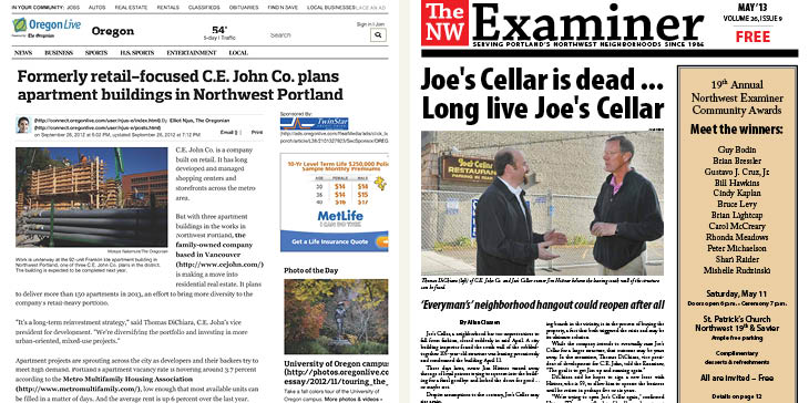
Interactions with local media became proactive, instead of reactive, and an historian even decided to include a building in his walking tour. From outsiders to community members known for their family legacy and quality developments, C.E. John was warmly welcomed to the neighborhood.
Award Winner:
2014 American Marketing Association MAX Award for “Best Branding Facelift”
Branding
Purpose
To build great places to work, play, and live by fusing comfort, community, and modern design. We envision inspired buildings that reflect our local roots and progressive thinking.
Tag-Line
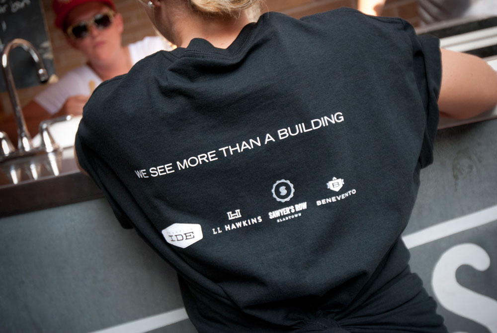
We see more than a building.
Demographic
Meet Dave, a 52 year old investor. He lives in the suburbs and drives downtown each morning for work. He is conservative and typically wears slacks and a collared shirt. At work he is detail-oriented, and his decisions, which he sees as a reflection of both the company and himself, are often based on intuition. He tends to be slow to open up or give trust. He comes off as quiet, but only because he is often compared to his extroverted wife. Though he rarely initiates conversation, he is an outstanding contributor. He has one daughter on the high school volleyball team, and a son in college. He goes out to eat at one of three restaurants every other Thursday night with his family.
Services
Services
- Identity (logo + styleguide + business cards + letterhead)
- Brand Architecture
- Community Outreach Strategy
- Press Relations
- Photography
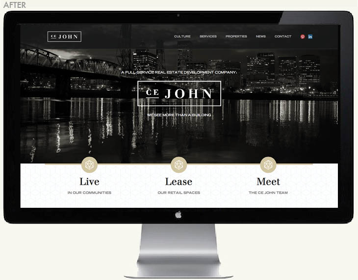
- Website
- Events
Time to completion
11 months
Results
How did we do?
“Green Rising has really helped us bring our brand to the next level. They’ve helped in brand design, community outreach, and really bringing the brand into a cohesive package that is refined, but still reflects our values as a family-owned real estate company.” – Scott Lindgren, Senior Vice President, C.E. John Company

 Identity (logo + styleguide)
 Identity (business cards + letterhead)
 Press Relations
 Website (before)
 Events
 Community Relations